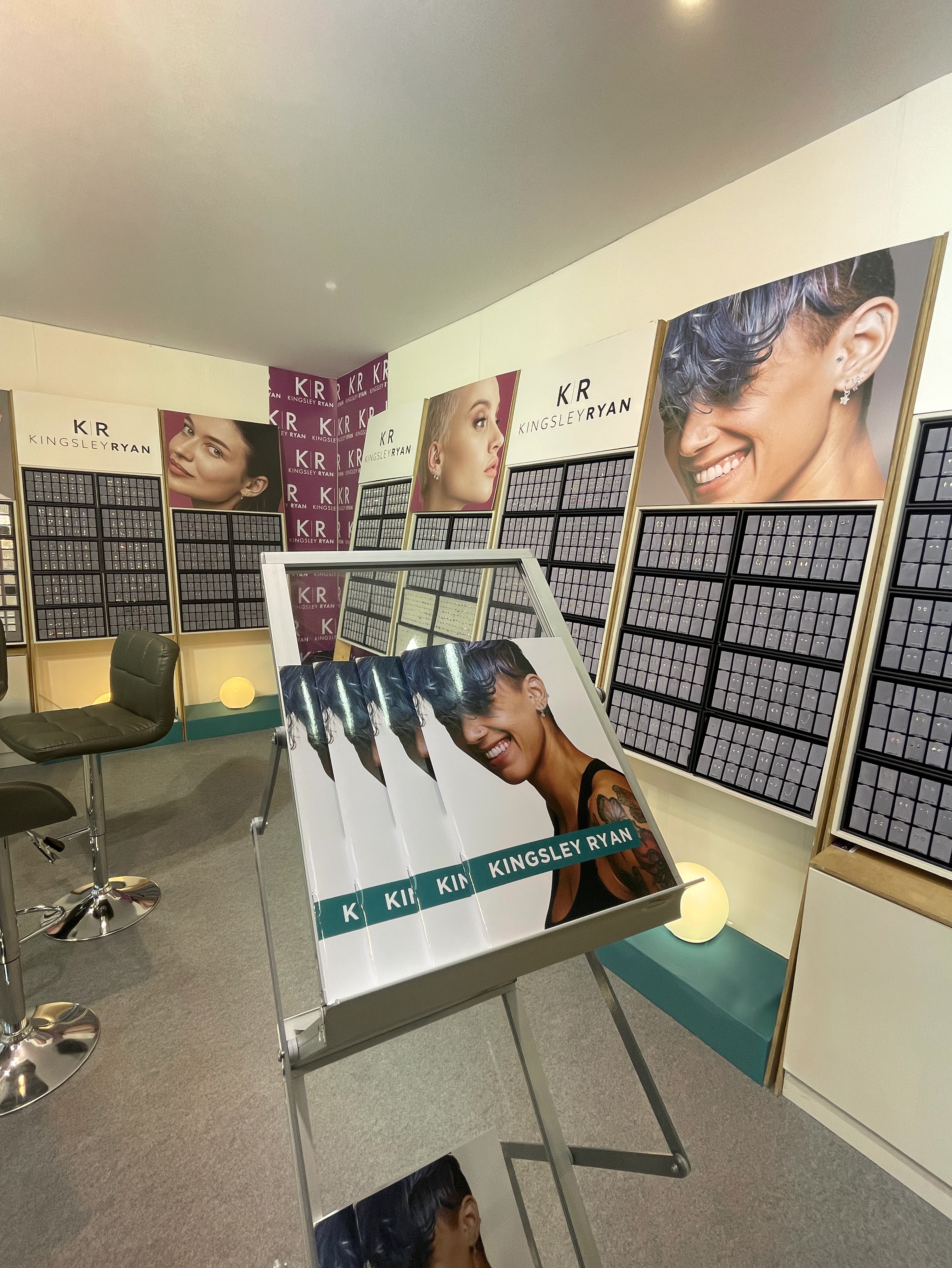
As part of my role at Kingsley Ryan, I led a comprehensive website refresh, which included a full rebrand. This encompassed a new website design, updated logo, brand guidelines, and refreshed website imagery.
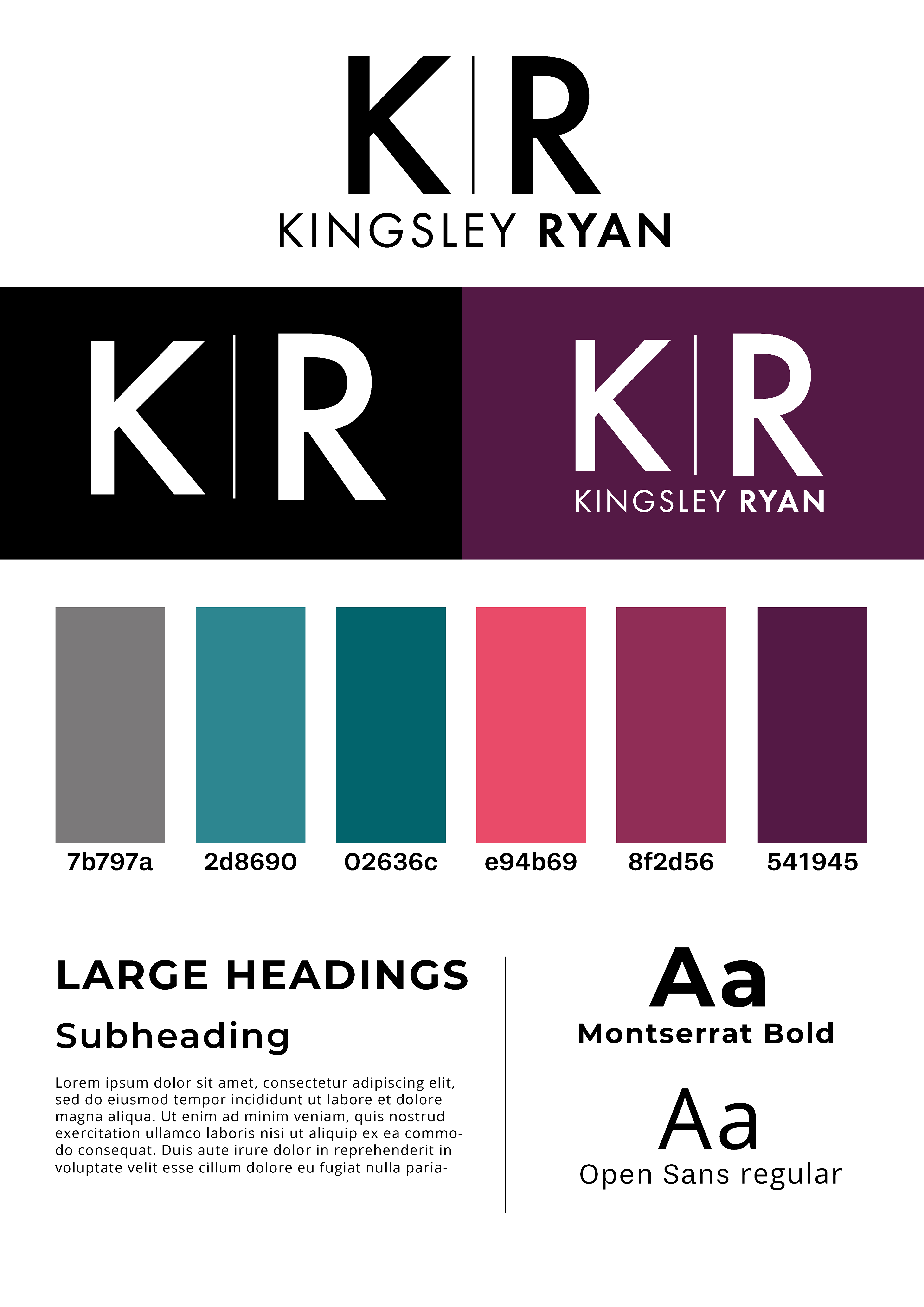
Brand Guidelines
The new brand guidelines introduced a fresh and cohesive visual identity for Kingsley Ryan. A refined colour palette was developed, featuring six core colours that balanced professional tones with brighter, more vibrant accents to inject energy and modernity into the brand. The logo was redesigned to be cleaner and sleeker, improving scalability and legibility across digital platforms. We also introduced a more contemporary font pairing to enhance readability and give the overall brand a more polished, sophisticated feel.
The updated colour palette and typography were seamlessly integrated into the website, giving it a much more modern, clean, and cohesive look compared to the previous design. The brighter accent colours added vibrancy without overwhelming the user, while the refined fonts improved readability across all devices. These visual updates not only enhanced the overall aesthetic but also contributed to a more engaging and user-friendly experience, aligning the site more closely with Kingsley Ryan’s brand values and target audience.
Check out the full website for yourself HERE
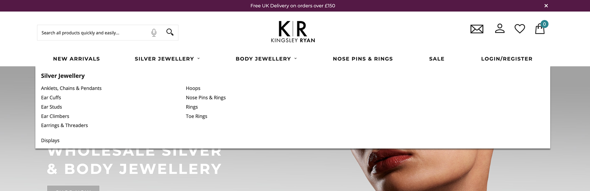
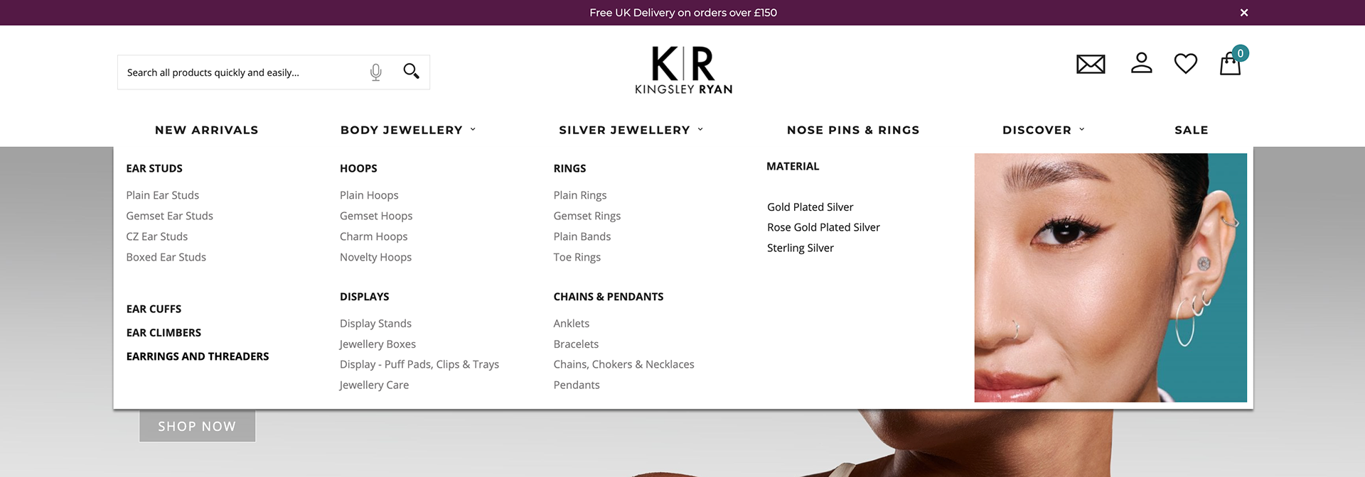
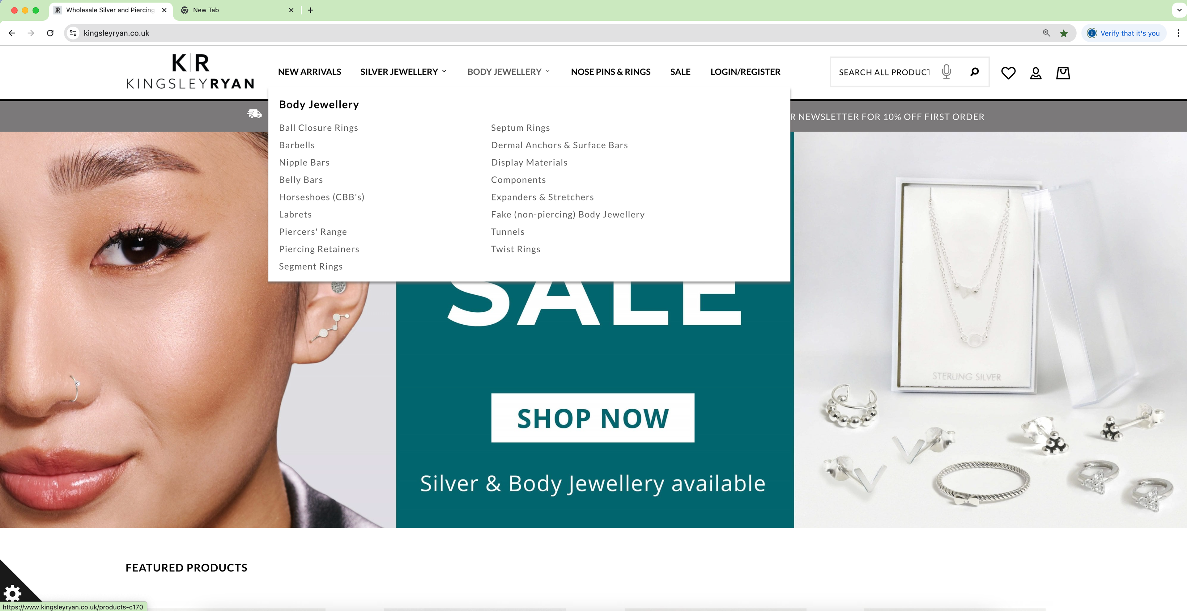
Navigation
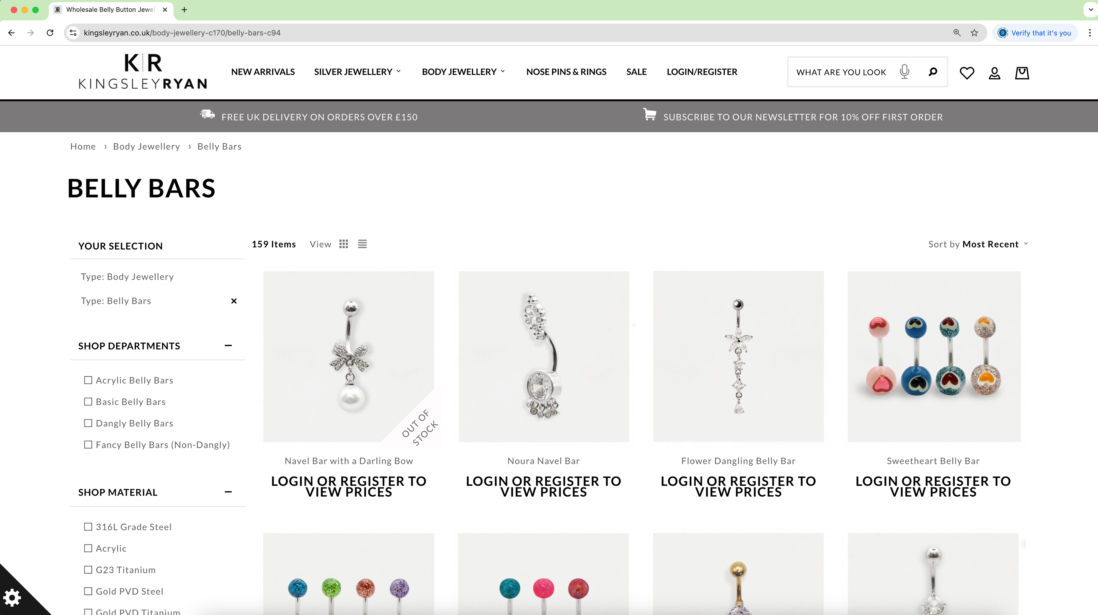
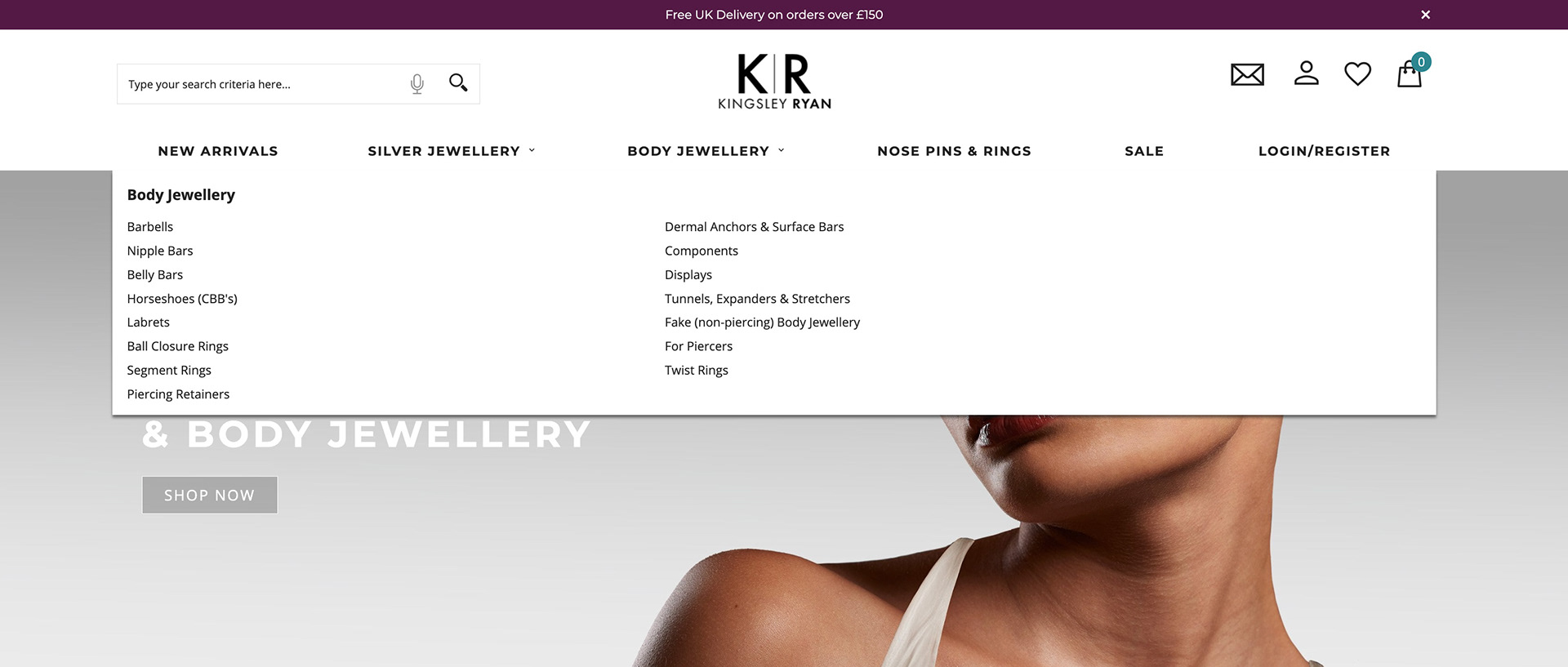
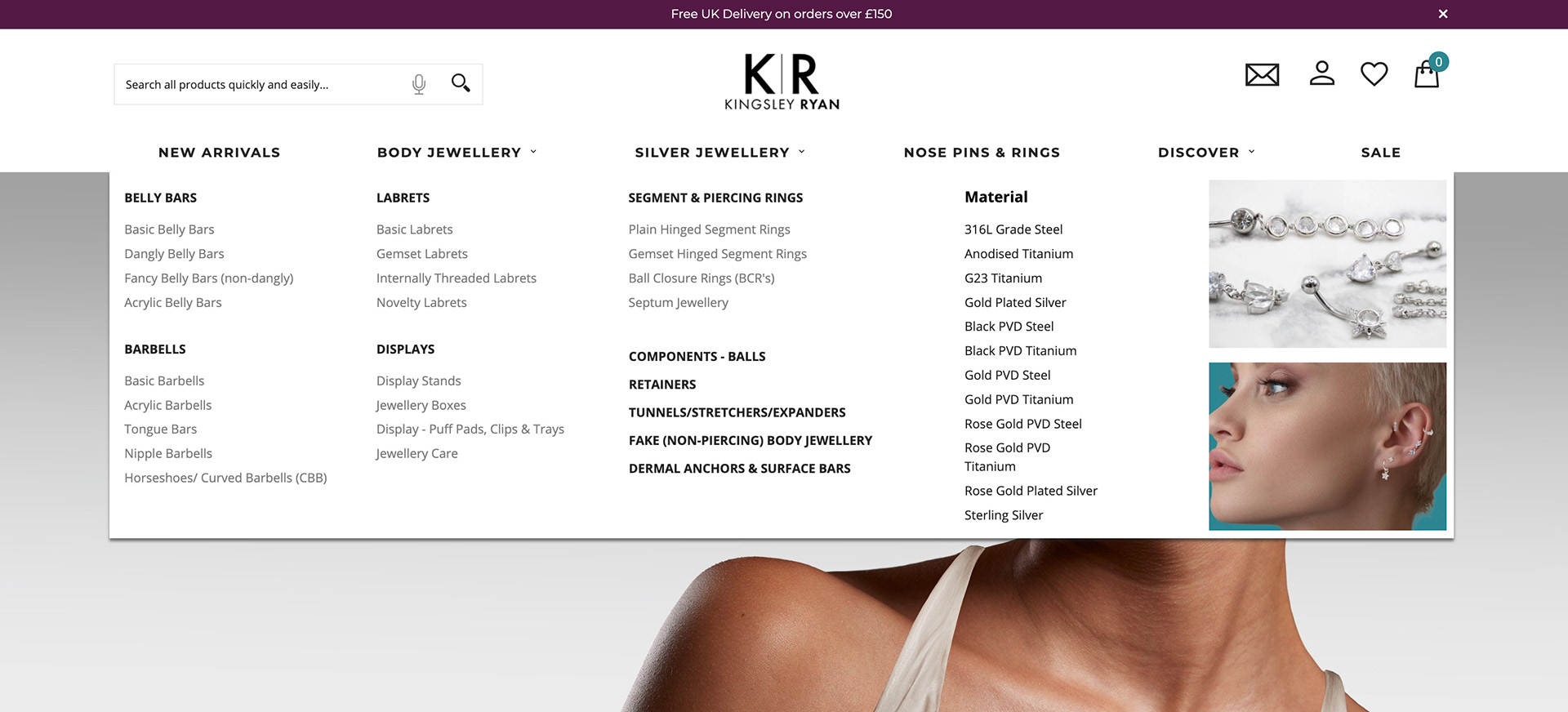
A key focus of the website refresh was improving navigation to enhance the overall user experience. The previous navigation was overly simplistic, making it difficult for users to explore the full product range. In the redesigned version, the product categories were broken down into more intuitive, manageable sections, making it easier for users to find what they’re looking for. We also introduced imagery within the dropdown menus — not only to add visual interest but also to provide a clear, immediate representation of the products, making the browsing experience more engaging and informative.
Design Process
Figma
Following the research and initial sketching phases, I transitioned the design into Figma, where I created an interactive, high-fidelity mockup of the proposed website. This prototype allowed the business to visualise the new look and feel of the site, explore user journeys, and provide feedback before development began. It ensured alignment with the brand vision while giving stakeholders a tangible preview of the refreshed design.
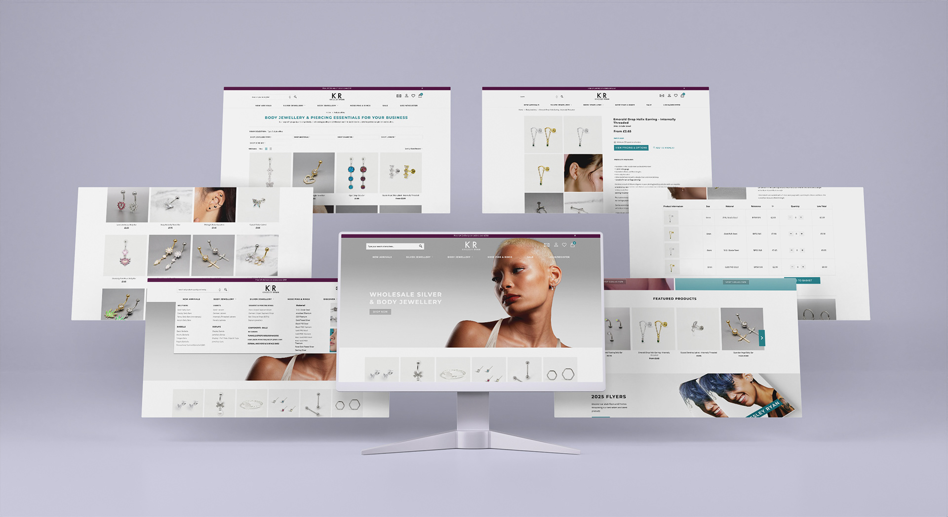
Shown on the left are screenshots from the previous version of the website, offering a glimpse into the original layout and design elements that were updated during the refresh.
Some key changes include:
- Navigation
- Colours and typography
- Selection of products moving to the top of the page requiring less scrolling.
- Product pages
- Website imagery