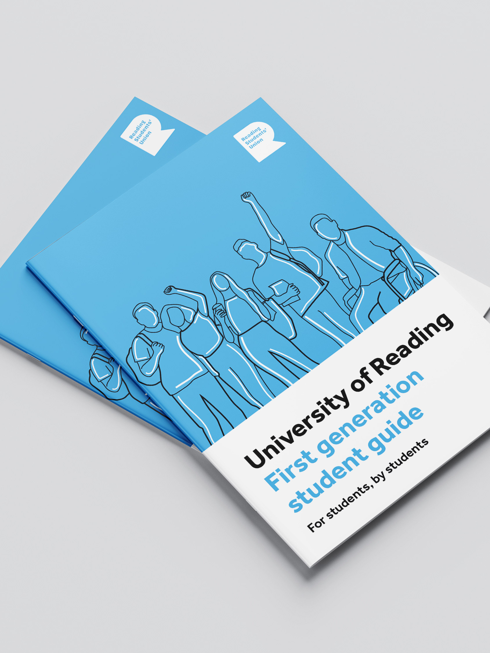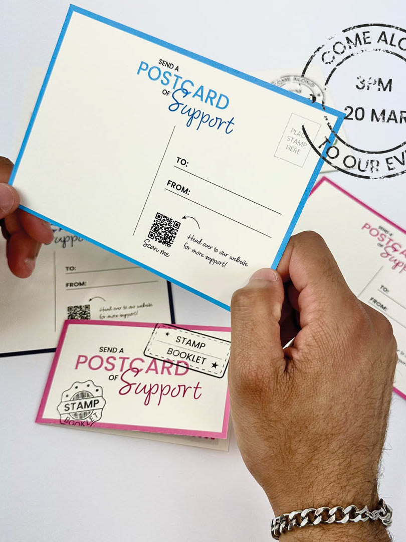
Front
Back
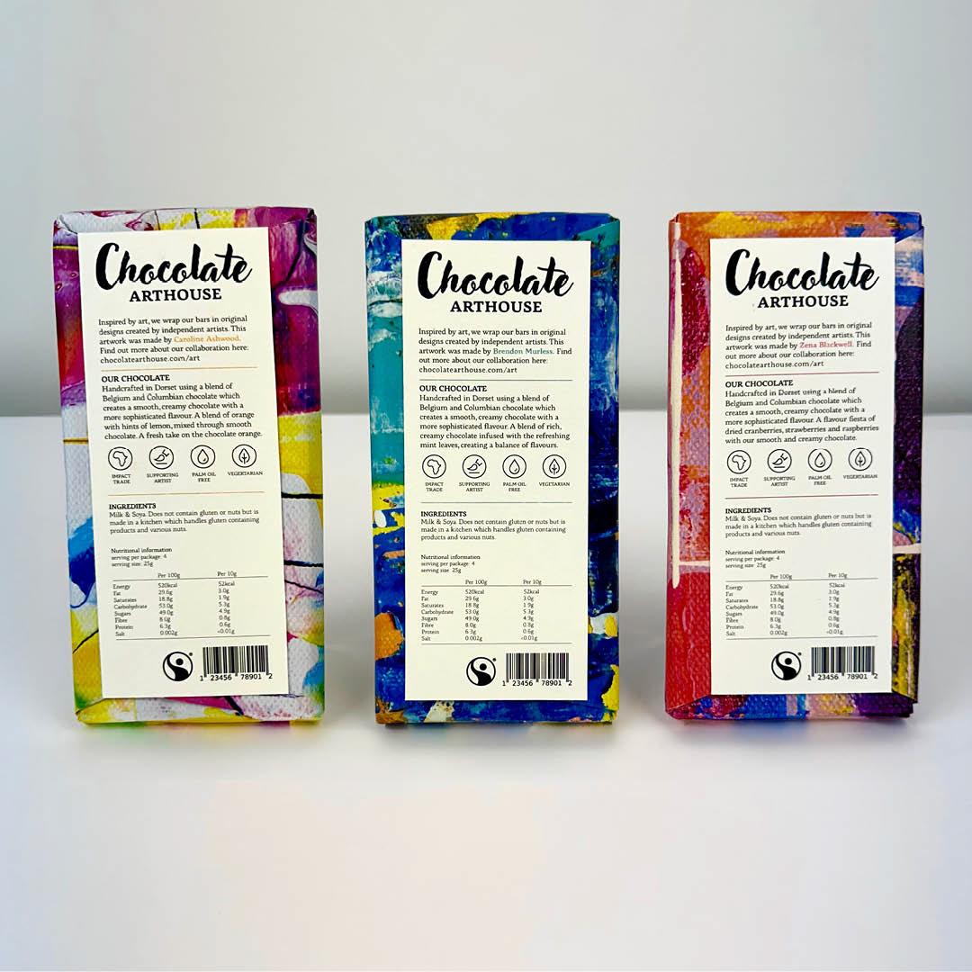
Concept
The concept of the Chocolate Arthouse re-brand is that is uses local artists’ work to wrap the bars. The three elements that the re-brand achieves are luxury, homemade and creative. The high quality paper and image quality used creates a luxury feel. The packaging achieves a homemade look with the hand-crafted wrapping style used. Creativity is reflected in the display of different artists as well as a new colourful website redesign.
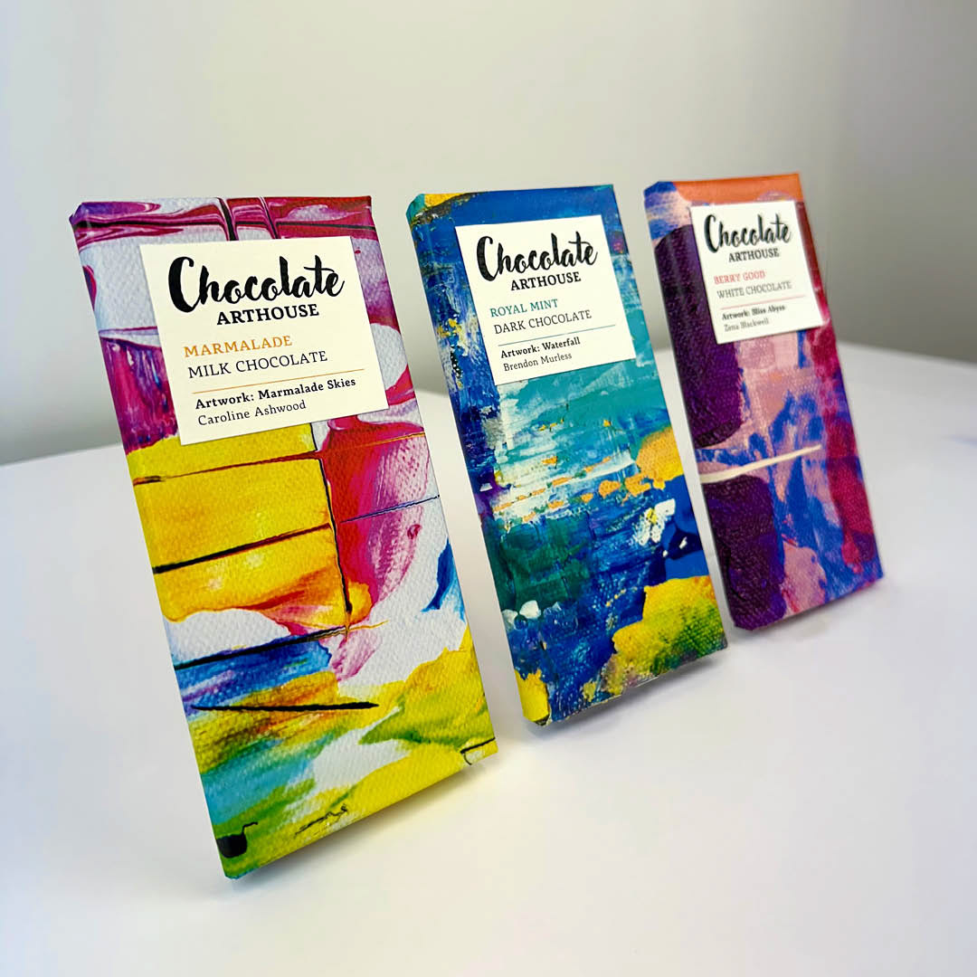
Multipack
To tie the multi-pack together I made a wrap around feature that goes across all three bars. Displaying the logo and bar information on the front as well as the four different artists. The back is kept simple with just the bar code and fair trade logo. The multipacks back label has less important features cut in order to work with the smaller size.

Chocolate bar series and multipack
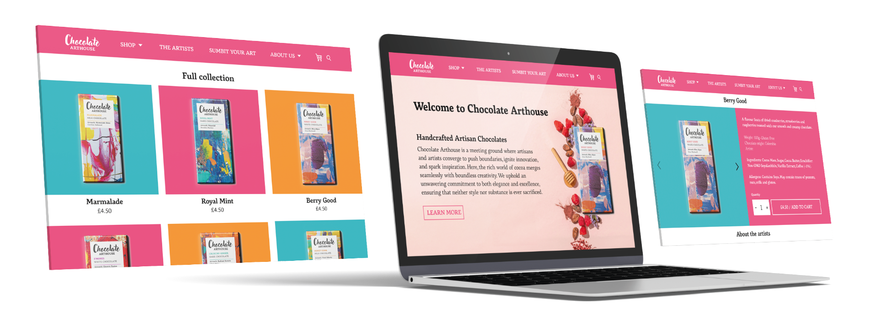
Chocolate Arthouse website
Website
The current website lacks any excitement and colour and does not fit with what the brand is trying to achieve. My redesign uses three bright colours along with lots more information about the chocolate, where it comes from and the artists that are featured. The home page is eye-catching for the user, making them more likely to buy the chocolate. The new shop page uses lots of bright colours with simple yet clean typography showing each of the flavours.
Social media
As a way for Chocolate Arthouse to connect with its audience, an Instagram feed template is used to enable them to reach a wider audience. The new Instagram serves as a launch for their new redesign of packaging and inclusion of artwork.
There are four main types of posts, showing new chocolate, artwork, the artists and the actual chocolate. This gives a balance to what the viewers see as well as being informative and visually appealing. The dedicated artist post is a unique and interesting feature for Chocolate Arthouse to help them generate interest and customers.
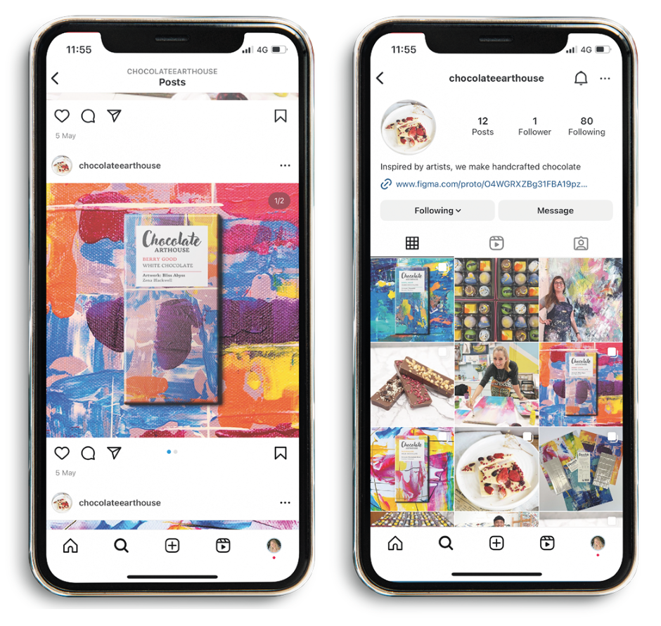
Chocolate Arthouse social media