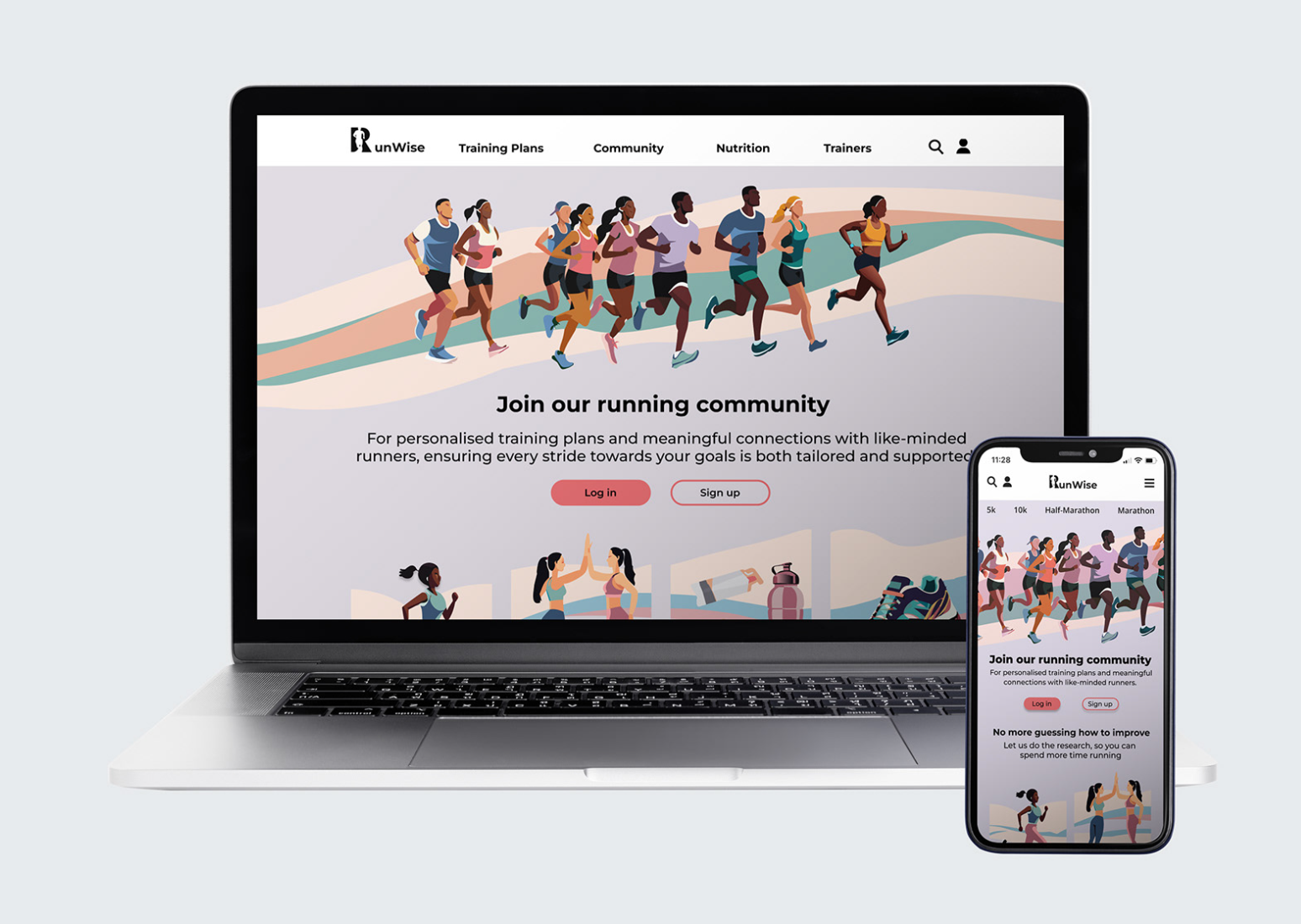
RunWise is a web app for runners looking for a training plan who seek a personalised training plan and all the information they need to complete their goals. RunWise is a web app that provides them will tailored running plans along with a way to communicate with fellow run-ners. This provides them with a weekly schedule with tailor trainers and nutrition advice. Unlike any other app, RunWise offers all the information you need in one place eliminating the time spent searching.
RunWise sets itself apart by offering a comprehensive approach to running training, nutrition, and communi-ty engagement all within one intuitive platform. Unlike generic training apps, RunWise provides personalised training plans tailored to individual goals and fitness levels, accompanied by expert nutrition advice to opti-mize performance and recovery. What truly distinguish-es RunWise is its vibrant community of runners, where users can connect, share experiences, and find motiva-tion and support. By integrating all essential elements of a successful running journey into a single, user-friendly interface, RunWise streamlines the user experience and empowers runners to achieve their goals with confidence and ease.
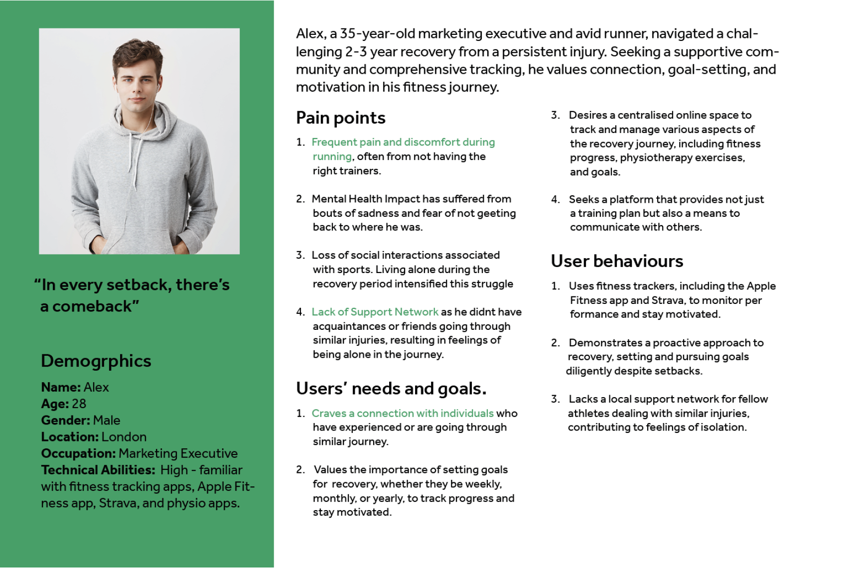
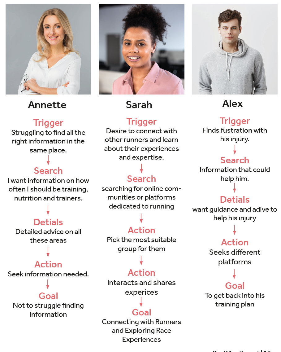
Alex
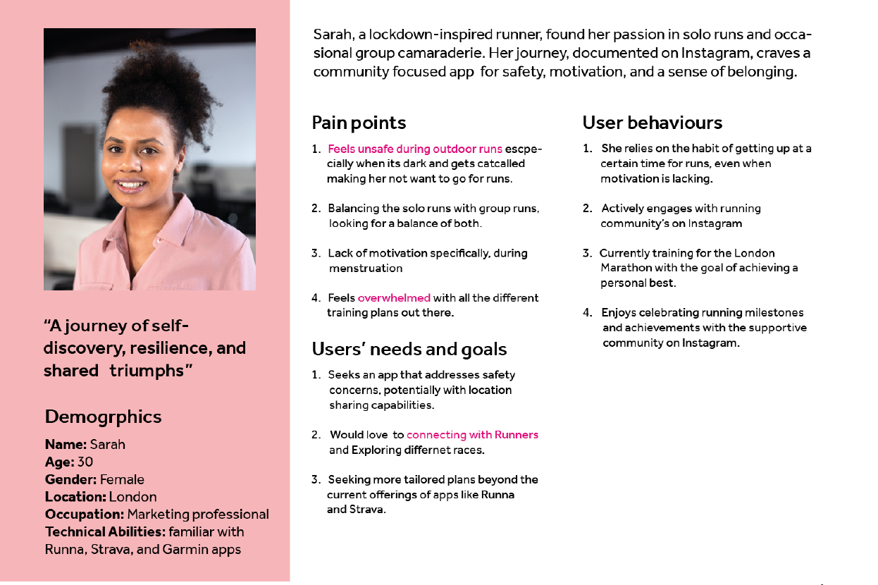
Sarah

Annette
User interview
I conducted a user interview with a 48-year-old mother of 4 who is training for her first marathon in June. We conducted user interviews before making a website to gain insights into user needs, preferences, and pain points. This helps ensure the website design meets user expectations, leading to improved usability, satisfaction, and overall success of the website. I have been put in a group with 4 other people who have similar website topics to me. This is so we can share our user interviews with each other to make sure our website targets a larger audience. Interview objectives The main objective for my interview was to understand what my user was missing and what type of features would be best suitable for her.
User interview conclusion
Based on the user’s responses, they have been running for fitness for a while but have recently joined a running club and participated in 10k fun run races. Their main goal is to complete a marathon to raise money for breast cancer, a cause that’s important to them, while also inproving speed and endurance.
They face challenges balancing training with a full-time job and four children. They have tried beginner marathon training plans but struggle with nutrition, choosing the right running shoes, pre-race nerves, and post-run re-covery amidst their busy schedule. They are comfortable using technology like Strava for tracking runs but seek additional features for training plans.
User journeys
User journey
I’ve learned that understanding the diverse needs and experiences of users is important. By delving into indi-vidual stories and perspectives, I gained valuable insights into common challenges, motivations, and preferences.
Alex

Sarah
Annette
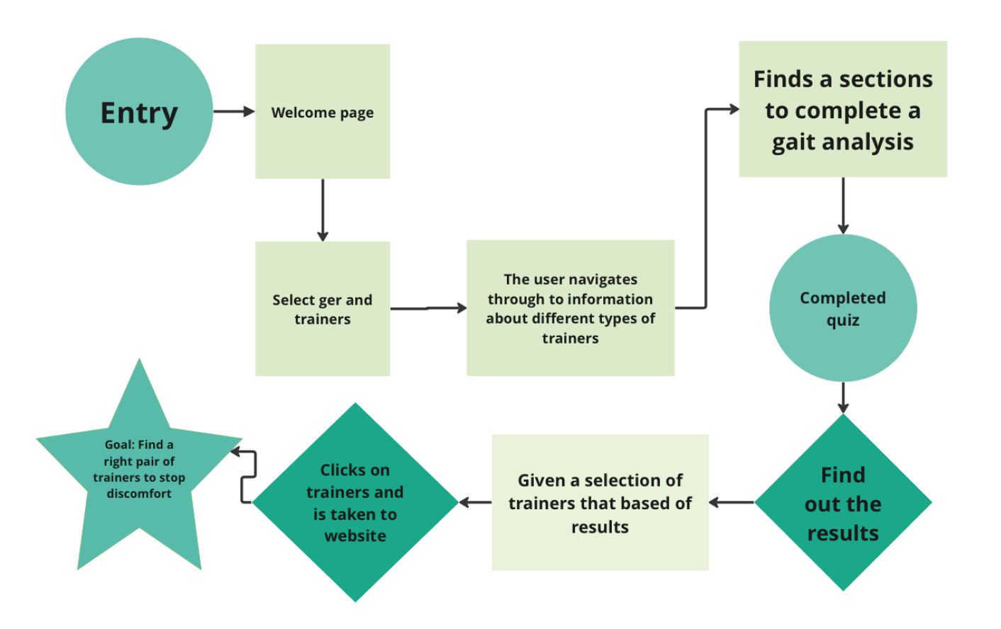
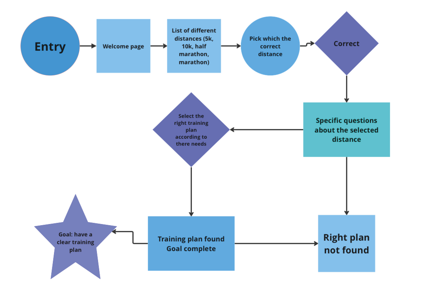
Page Flow
Annette’s page flow is based of her user persona where she is training for her first marathon. Based on this her page flow consists of her filling out some questions in order to get a personalised training plan that will help her complete her goal. Based of Sara’s user persona she wants to find a running community and chat with fellow runners. Based of Alex s user persona and interview I have learnt that he is suffering from pain while running specifically from his trainers.
The purpose of creating page flows was to visually map out the user journey and interactions within a website or application, enabling designers and stakeholders to gain a comprehensive understanding of the user experience and identify opportunities for optimisation.
Cite map
This site might outlines the pages and content that will be included in my website. The darker boxes are the pages and the lighter boxes are the sub pages and information within.

Cite map
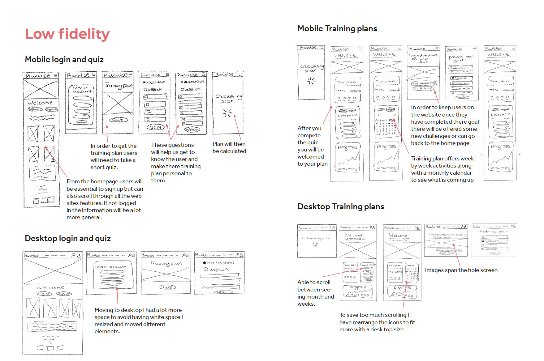
Low fidelity wireframes
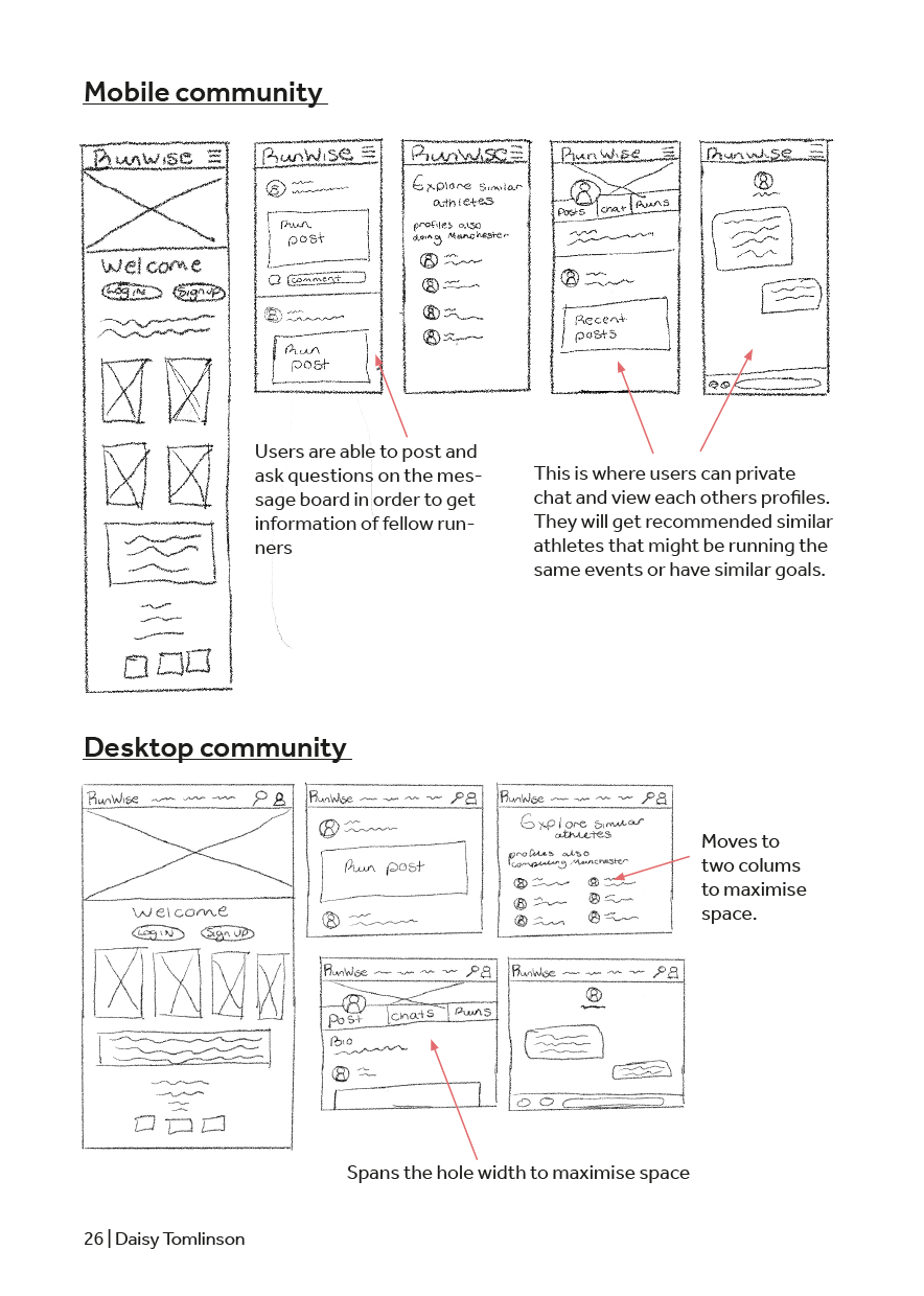
Low fidelity wireframes
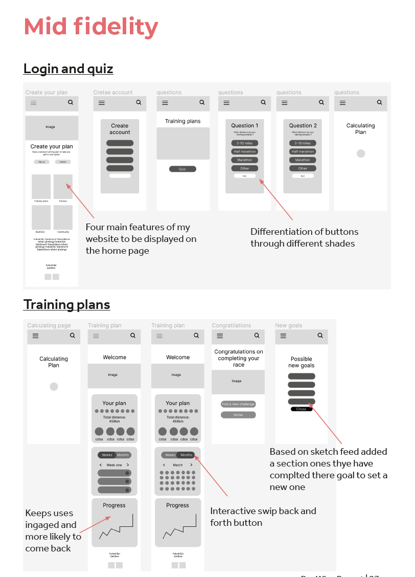
Mid fidelity wireframes
Mid fidelity wireframes
After receiving feedback from peers and tutors regard-ing my low and mid-fidelity it came to my attention that some of the buttons and pages feel more like an app than a website. The feedback serves as a valuable reminder of the importance of aligning design decisions with the intended platform and user expectations.
Usability testing
From my user ability testing, I learnt a lot about my web-site. As user highlighted the community aspect and ease of navigation as positives. They found the training plans section and easy access from the top menu to be the most useful information. However, they noted draw-backs such as the lack of detailed descriptions for some training plans. Additionally, users found it challenging to navigate back to the main page if they clicked on the wrong section. The user also noted a drawback regarding the lack of a clear sign-up process. This absence made it challenging for them to easily register or access additional features, not allowing them to get the personalised training plan they wanted. A clear and intuitive sign-up process would enhance the user experience by streamlining access to the community and training resources. Overall, while users appreciated the clear navigation and useful content, improvements in providing detailed descriptions and enhancing navigation back to the main page would enhance the user experience further. To address the issues, I’ll create a clear registration but-ton for easy sign-up, enhance training plan descriptions for clarity, and streamline navigation to prevent user confusion, improving overall usability and engagement on the website.
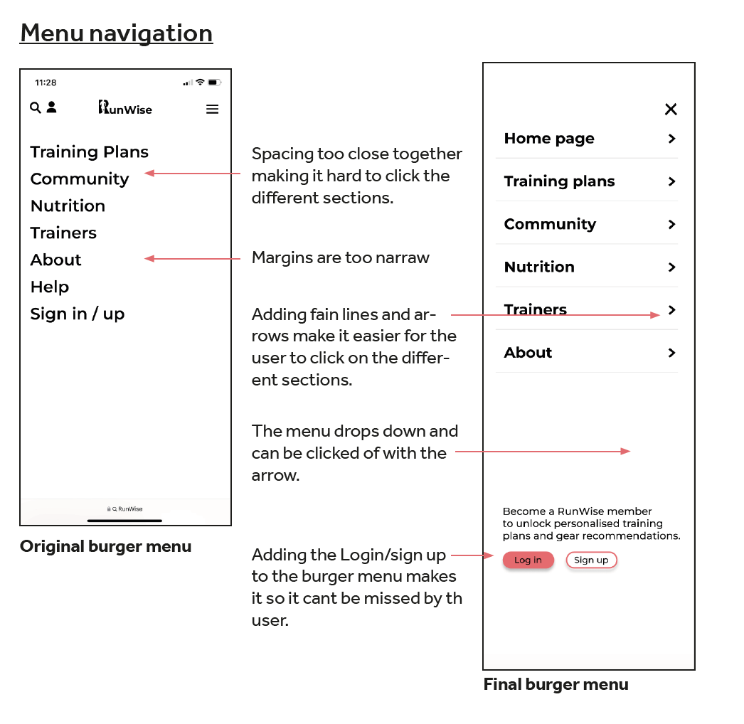
Menu navigation development.
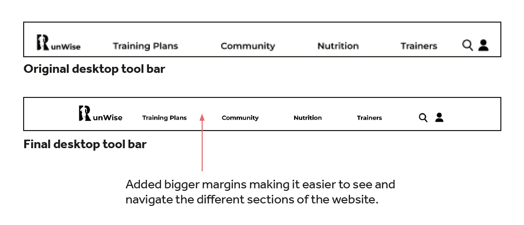
Tool bar development.
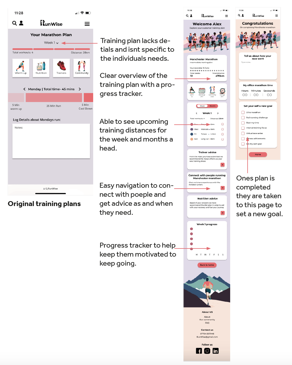
Training plan development
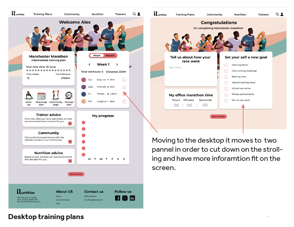
Desktop training plan development

Grid development
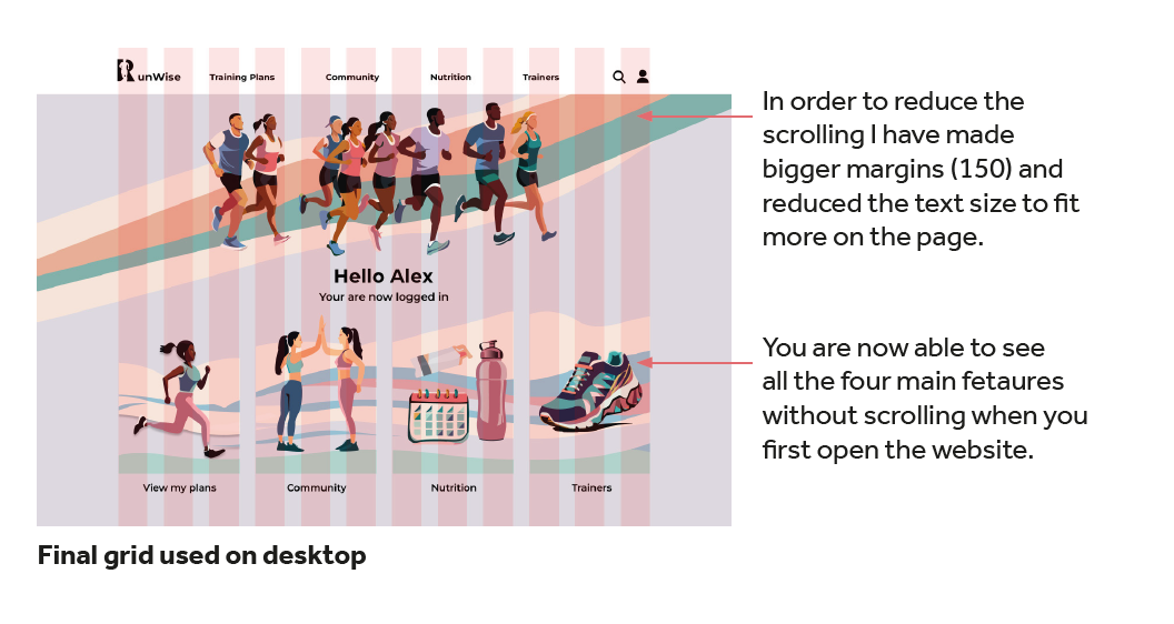
Final grid system
Branding
Choosing a bright and vibrant colour palette of five colours with two lighter back-ground tones. Bright colours are visually engaging and can evoke positive emo-tions, making the website more appealing and memorable to users. Additionally, a diverse range of colours allows for ef-fective visual hierarchy, helping to differ-entiate between different sections and elements on the website. The inclusion of lighter background colours ensures read-ability and accessibility, as this provides high contrast for text and illustrations.
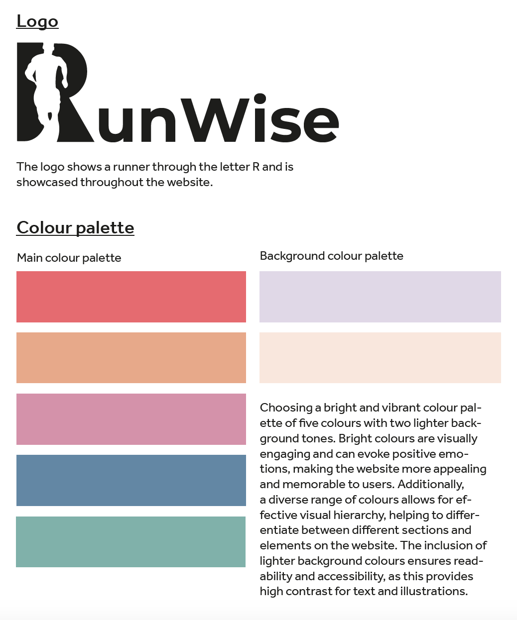
Logo and colour palette
Illustrations
I chose to design my website using illustrations rather than photographs for several reasons. After experiment-ing with both I decided that illustrations offer a unique and distinctive visual style that can be customised to perfectly reflect my brand’s personality and values. Illustrations provide more flexibility as I don’t have to search from the right pictures and can allow for more unique concepts or ideas. Additionally, illustrations tend to be more cohesive and consistent in style, ensuring a seamless and harmonious design across all elements of the website.
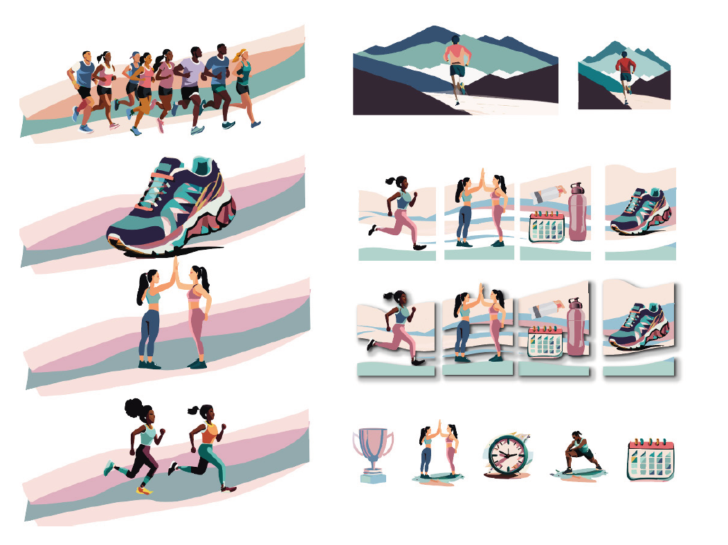
Illustrations used in website
To conclude, the journey of creating RunWise is both a mobile and desktop version. Through competitor analy-sis, I identified gaps in the market that RunWise aims to fill, offering unique value propositions to users. Conduct-ing user interviews and crafting persona based on peer insights provided valuable perspectives, allowing for the creation of tailored user flows that meet their diverse needs. Additionally, developing page flows and wire-frames helped visualise the user experience and refine the website’s design and functionality. By integrating these processes, RunWise emerges as a comprehensive solution that addresses user requirements and delivers an engaging and intuitive experience for both mobile and desktop users with the use of illustrations and a vibrant colour palette.